RWD – have you got it?
People are now visiting publisher websites from an array of devices, including computers, tablets and smartphones. As a publisher, you want them to be able to navigate your site easily and find what they’re looking for quickly, whatever device they’re using – and then you want them to browse some more, because the experience is good and doesn’t involve pinching, zooming or standing on their heads. How do you achieve this? How do you ensure that your website works well on every device your readers are likely to use?
Enter responsive web design, or RWD for short.
With the growing ownership of tablets and smartphones, resulting in a huge increase in the mobile share of web traffic, 2013 is likely to be the year of RWD. Publishers need to be part of this trend. In the coming months we’ll be offering to incorporate RWD into existing client sites and will make it part of new website development projects for publishers.
What is RWD? In essence, it’s web design with multi-device functionality. RWD sites automatically adapt themselves to the devices on which they’re viewed. They are built using CSS techniques and design principles, primarily ‘media queries’, ‘fluid grids’ and ‘flexible images’. The media queries facility (created by W3C as part of the CSS3 specification) enables a site to work out what device it’s being viewed on and then, via the fluid grid and flexible image facilities, to change in various ways so that it fits the screen. For example, layouts will change from three- to one-column or vice versa, images will shrink or get bigger, and the navigation mode will change.
For website designers, RWD involves a new way of thinking about web design. Gone is the old linear process, usually involving a briefing stage, a structural planning stage and then a visuals stage; the RWD process is more fluid and circular, involving sketching and prototyping. Navigation needs to be scalable, and images need to be resizable so that graphics on high-pixel-density devices aren’t blurred. Converting old fixed-width sites can pose problems, but the current consensus is that this should involve a rebuild of templates and stylesheets.
For website owners, the main issue that RWD addresses is that, with the ever-widening range of screen sizes and resolutions, creating a different version of a website that targets each type of device on the market is just not practical. There are also SEO benefits from maintaining a single website, as opposed to having one website for desktop devices and another for mobile devices.
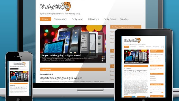
To see how an RWD site works in practice, via your computer go to www.firstynews.com, our RWD-based news website; then bring up the same site on your smartphone and/or tablet, and see how the site reorganises itself. If you don’t have all these devices to hand, go to http://responsive.is. This brings up a website page, along the top of which are five symbols depicting various devices; click on these in turn to see how the website page adapts itself to each device.
And you will see why, in web design circles, they are saying that 2013 is going to be the ‘responsive year.’
Related Posts

Nine tools for successful publishing in 2017 →

Boydell & Brewer launches →

Ecommerce site for Carlton Books →